Interactive Reports
At Vcheck, I led the redesign of our due diligence reports, transforming them from static, overwhelming PDFs into an interactive, human-friendly experience. This new format improved readability, streamlined access to key insights, and helped clients focus on what matters most, faster.
Challenge
The original PDF reports were dense and cluttered. Clients struggled to identify what was relevant to them. These reports lacked structure, visual hierarchy, and any digital functionality. Users had to scroll through long documents without guidance, which led to confusion and a poor experience overall.
Opportunity
This was a chance to rethink the report not just as a deliverable but as a product experience. By structuring content dynamically and adding interactivity, we could empower clients to explore only what they need. It was also an opportunity to bring reports into the platform and create a seamless, end-to-end workflow.
Strategy & Collaboration
I worked closely with product managers to deeply understand requirements. Investigators shared the raw data inputs and helped me map how every insight was generated, ensuring accuracy in the final output. Engineers contributed early on with clear technical constraints, helping us build realistic interactions and scalable patterns.
Modular structure: Break down dense report data into manageable, collapsible sections for better focus and navigation.
Readable and visually engaging: Use layout, color, and visual hierarchy to guide attention and reduce cognitive load.
Approachable for all users: Simplify legal language and added contextual cues to make the report understandable.
User Research
To understand how clients interacted with our previous PDF reports, I conducted interviews with investigators and reviewed support tickets and client feedback from the past quarter. We also hosted 1:1 sessions with account managers who regularly walk clients through reports.
72% of complaints cited reports as too long or hard to navigate.
60% of investigators said clients missed key findings.
52% of follow-up calls were spent explaining report sections.
Our goal was to make reports feel less like decoding a legal document and more like navigating guided insights.
Final Design
The new Interactive Report introduces a structured, intuitive, and visually engaging format. It allows clients to navigate and consume information at their own pace without being overwhelmed.

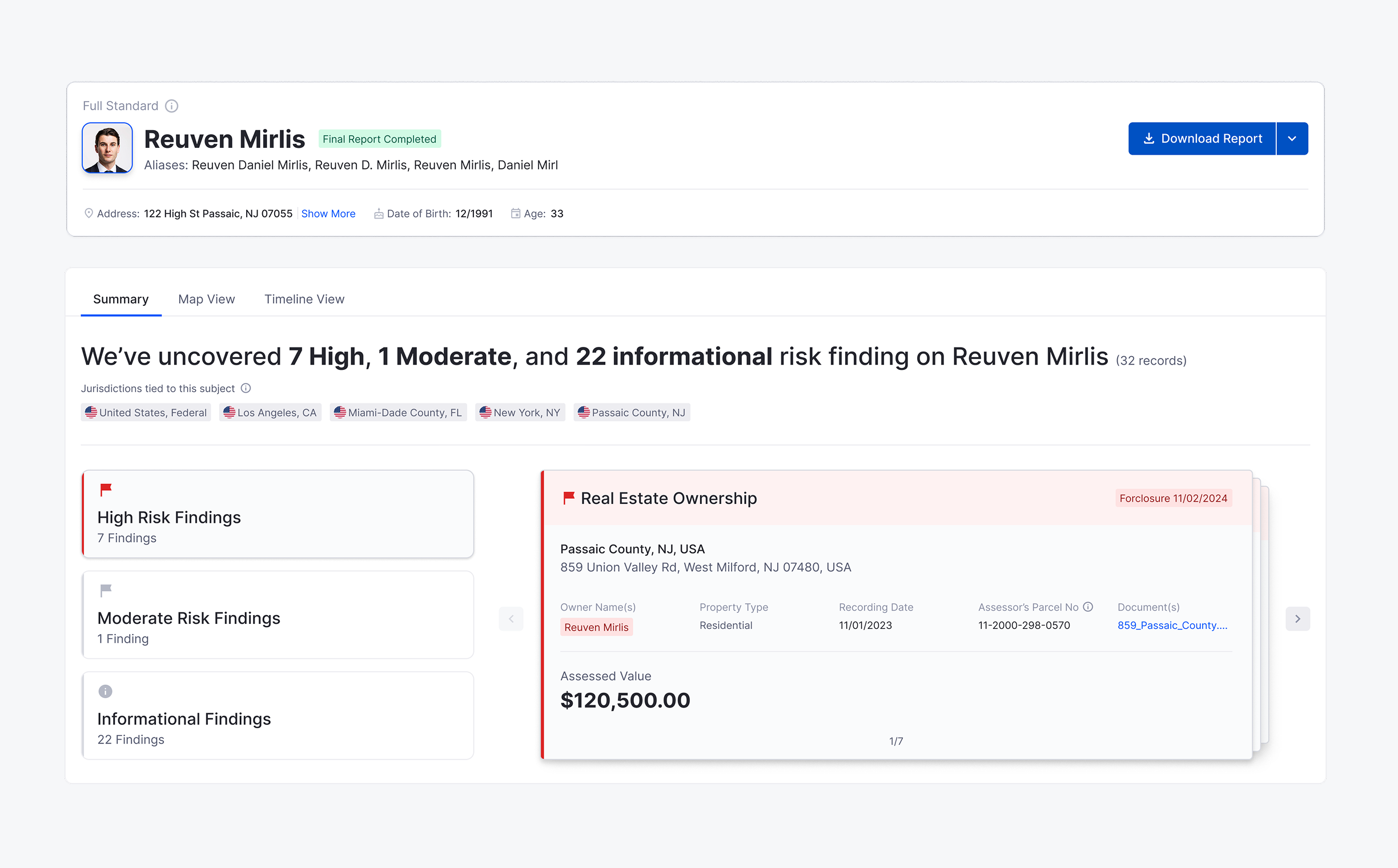
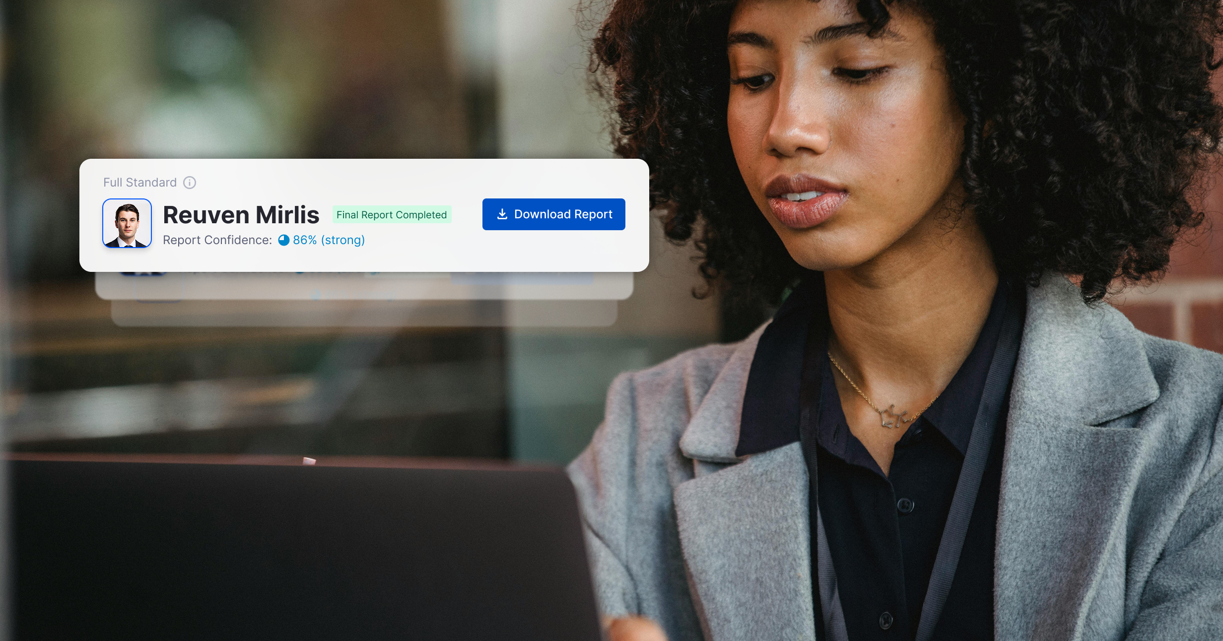
High-Level Summary
A quick snapshot showing the overall status of key findings like high risk, moderate risk, informational, and no findings. Iconography and colors help users understand findings at a glance.
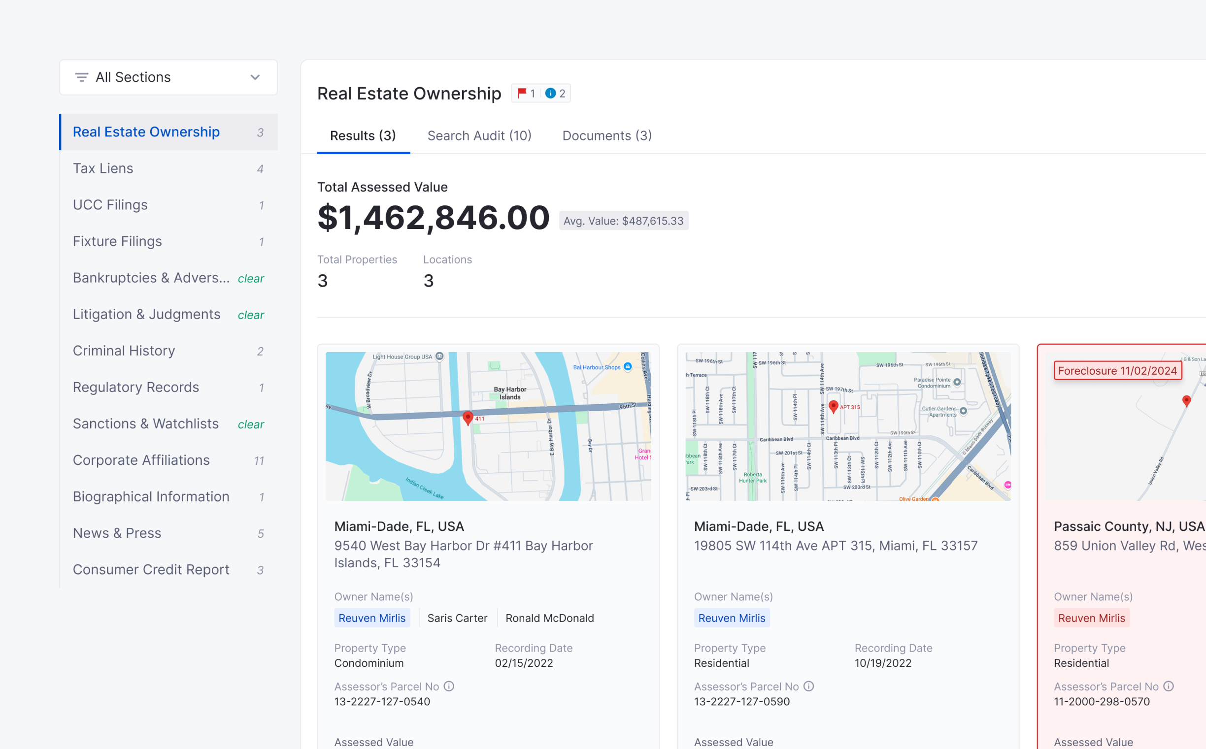
Navigation & Filtering
Users can toggle between sections, this makes it easier to focus only on what’s relevant, without getting lost in legal details.

Plain-Language Support
Legal or compliance-heavy language is paired with short descriptions and tooltips to help clients unfamiliar with legal terms.
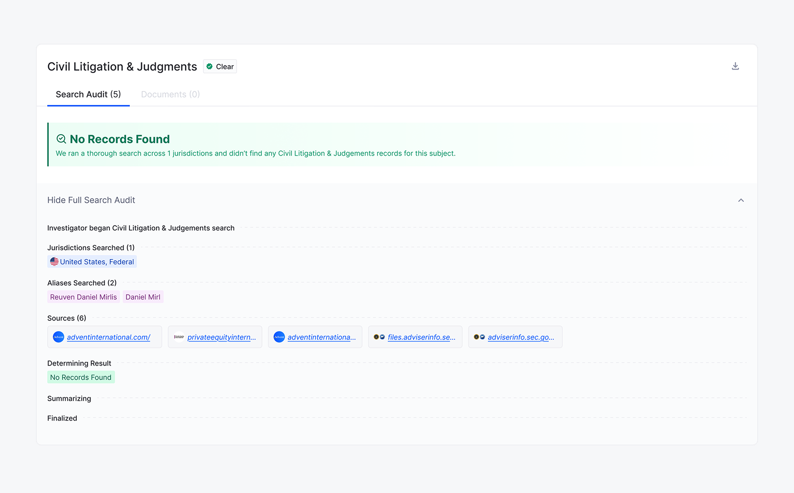
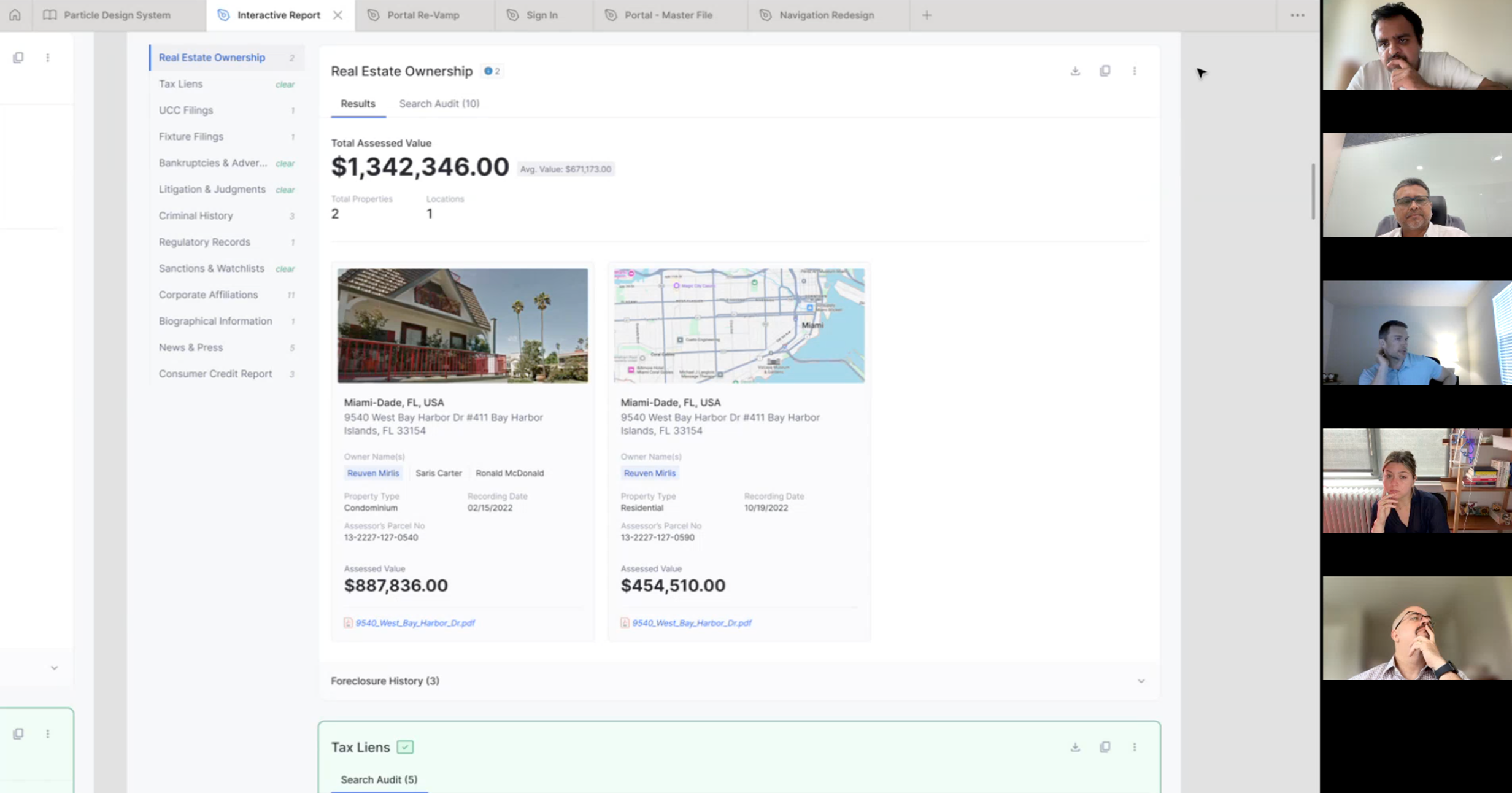
Search Audit Trail
Displays how many databases and jurisdictions were searched. Gives clients visibility into the depth of work done behind each section.
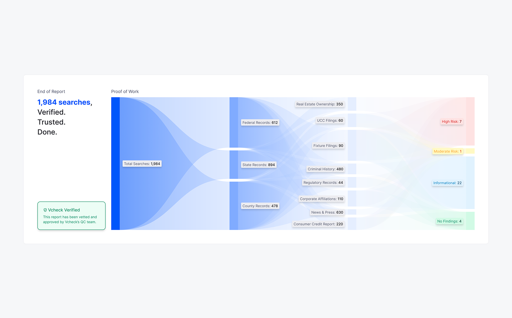
Proof of Work
A visual breakdown of all searches and findings, showing exactly where and how information was gathered, reinforcing trust and effort.

Continued Flow
At the end of the report, users can smoothly continue to the next subject within the same project. This keeps large multi-subject reviews efficient and uninterrupted.
Results
67% spent less than half the time reviewing compared to the old PDF.
Investigators reported a 38% drop in follow-up clarification emails.
Stakeholders said clients could spot High Risk Findings much faster.
What I Learned
Clarity is a product feature. Simplicity in structure made dense reports easier to act on.good system is invisible—it empowers creativity without getting in the way.
Context empowers users. Filters, summaries, and plain language gave users control.
Collaboration sharpens outcomes. Early alignment kept the design grounded and efficient.
Next Project
Created a robust, tokenized design system powering multiple teams at Vcheck. 60+ components. 200+ variants. Zero guesswork.
Let’s build something meaningful!
Currently open for freelance and part-time projects.